
Deadly Brows
industry
Natural Brow Studio
what we did
Brand Identity + Collateral Design
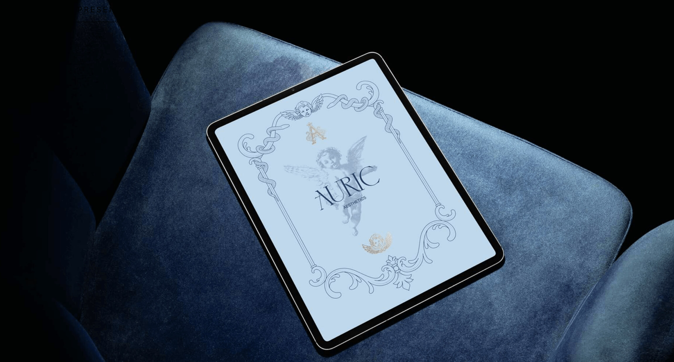
A brow studio inspired by “the look”
How do I even write an intro to a project that combines brows, the immaculate and oppressive beauty of Catholic aesthetics, and a movie so shocking it made me lose my appetite for 3 days? Well, I suppose this is a start.

How it started
As with many of our projects, it started with a business owner struggling to put her darkly-inclined personality into her brand in a way that would be palatable to the general public to avoid scaring away her customers - “regular” people. And not only that… As a catholic, she wanted to incorporate elements that related to her religion, without making it weird. So the execution needed to be GOOD.
And so Deadly Brows was born. Amidst a sea of brow studio brands laced in pink and sparkles trying their best to look as modern as possible, we looked towards the opposite direction and brought out the heart-stopping, oppressive beauty of baroque art. Specifically, representations of women with THAT look on their face - that fascinating gaze representing religious ecstasy, - or transcendence according to the movie Martyrs. This created an interesting parallel since Deadly Brow’s focus, as a brow studio, is precisely women’s eyes.


Pious
Sacred
Somber
Feminine


Designing a brand with an antique aesthetic is easy. The hard part is making sure it looks coherent in the context it will be seen

Solution
The challenge was to get the antique references to work on modern scenarios like social media and websites, and look coherent in her studio, next to her modern equipment, modern lights, and all the necessary things for the business to operate.
So the strategy was to balance those antique elements with modern elements, like the fonts, logos, photography, and overall layout of the designs. Plus some gothic elements for that extra SPICE and emotional connection with the business owner.
I care a lot about that. As much as we’re designing for the public, my point of view is that the deeper a connection the owner feels to their brand, the bigger are this business’ chances of succeeding - which is always my #1 priority. So yeah, I try to do my part. If this resonates with you, visit our contact page and tell me about your brand. If you're into the stuff we create, chances are I'm very much interested in doing the same for you.


Here’s what Andrea had to say about our brand identity project
Andrea
Founder & CEO
“I was nervous in the beginning because I only had a general direction in which I wanted to take my brand but the details were muddy so I knew whoever I chose to create this brand had to be someone I trusted. Virginia definitely gave me that confidence to let her do what she does best while taking my general desires into consideration.
In the end my brand was a literal dream! I never thought what small vision I had could turn into something so incredibly beautiful.
Virginia gave me what I expected and a hundred fold more which I will be forever grateful for. I could not have picked a more passionate expert who delivers only the best of the best!“


.jpg)
.jpg)
.jpg)
